T. ROWE PRICE
Unifying a fragmented digital ecosystem
Unifying a fragmented digital ecosystem
INDUSTRY
Financial Services
Financial Services
Financial Services
ROLE
Sr. UX Designer
Sr. UX Designer
Sr. UX Designer
YEAR
2023-24
2023-24
2023-24
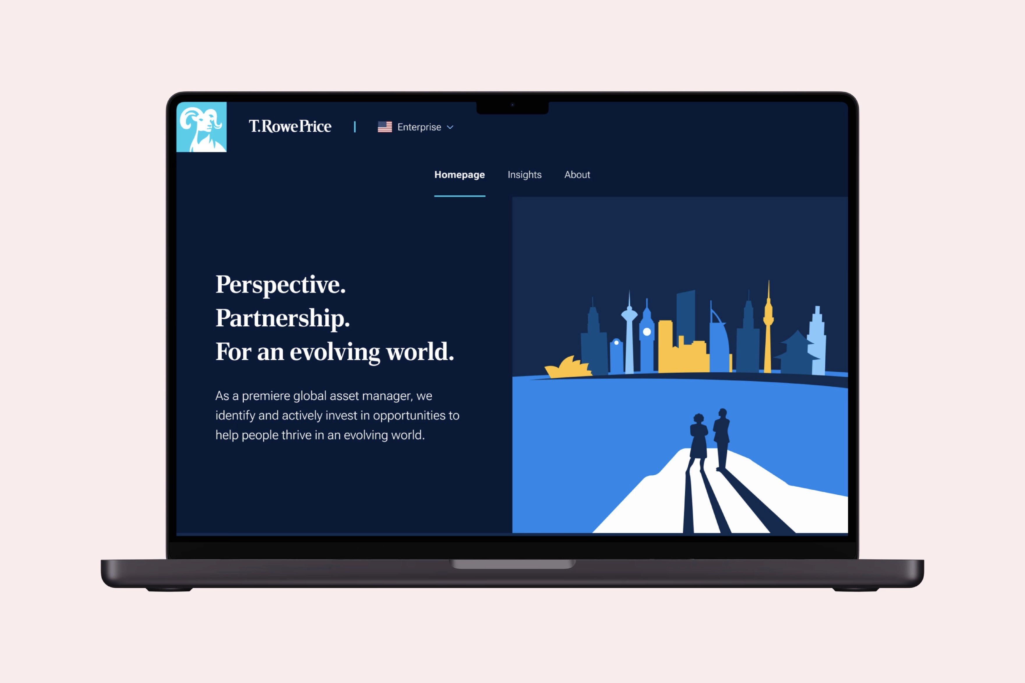


T. Rowe Price had a fragmented digital presence with 111 micro-sites, resulting in design inconsistencies and duplicated publishing. About 60% of content across the sites was common, causing duplication and SEO cannibalisation. The "Enterprise site" initiative aimed to unify user experience and streamline operations using a common design system and the COPE model to boost consistency and efficiency.
T. Rowe Price had a fragmented digital presence with 111 micro-sites, resulting in design inconsistencies and duplicated publishing. About 60% of content across the sites was common, causing duplication and SEO cannibalisation. The "Enterprise site" initiative aimed to unify user experience and streamline operations using a common design system and the COPE model to boost consistency and efficiency.
T. Rowe Price had a fragmented digital presence with 111 micro-sites, resulting in design inconsistencies and duplicated publishing. About 60% of content across the sites was common, causing duplication and SEO cannibalisation. The "Enterprise site" initiative aimed to unify user experience and streamline operations using a common design system and the COPE model to boost consistency and efficiency.
Outcomes
Outcomes
2,450
2,450
daily visitors
daily visitors
increase in individual investor conversion
increase in conversion overall
Shaping the MVP
Stakeholders lacked clarity on phasing the Enterprise site’s development. I emphasised that user needs should guide the rollout strategy.
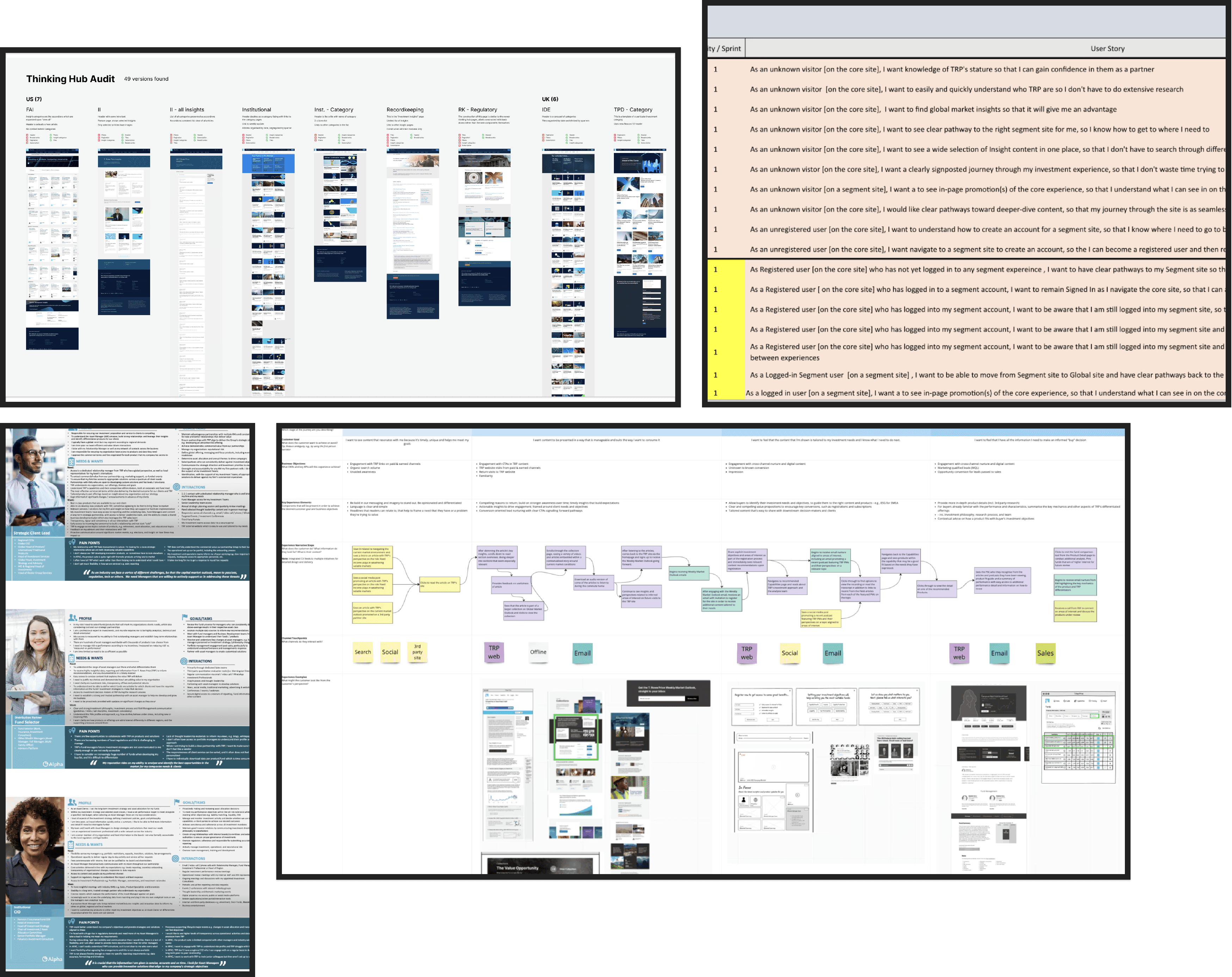
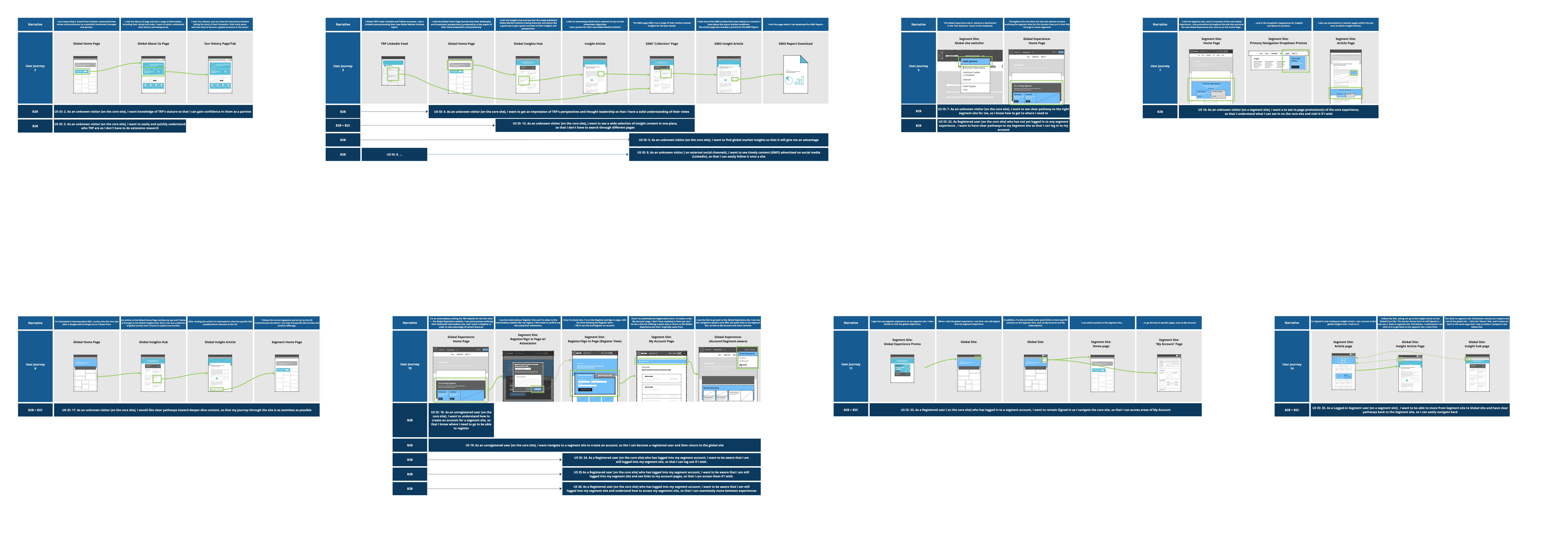
Alongside another designer, I audited existing templates, studied audience profiles and conducted journey mapping to deepen our analysis.
Due to regulatory constraints, product information could not be shown without self identification. Consequently, users would stay on the Enterprise site only up to the consideration phase before moving to a micro-site for detailed product information. This defined the site’s primary focus as acquisition and education.
With these insights, we drafted and refined user stories with the Product Owners, establishing well-defined requirements for the project.

Information Architecture
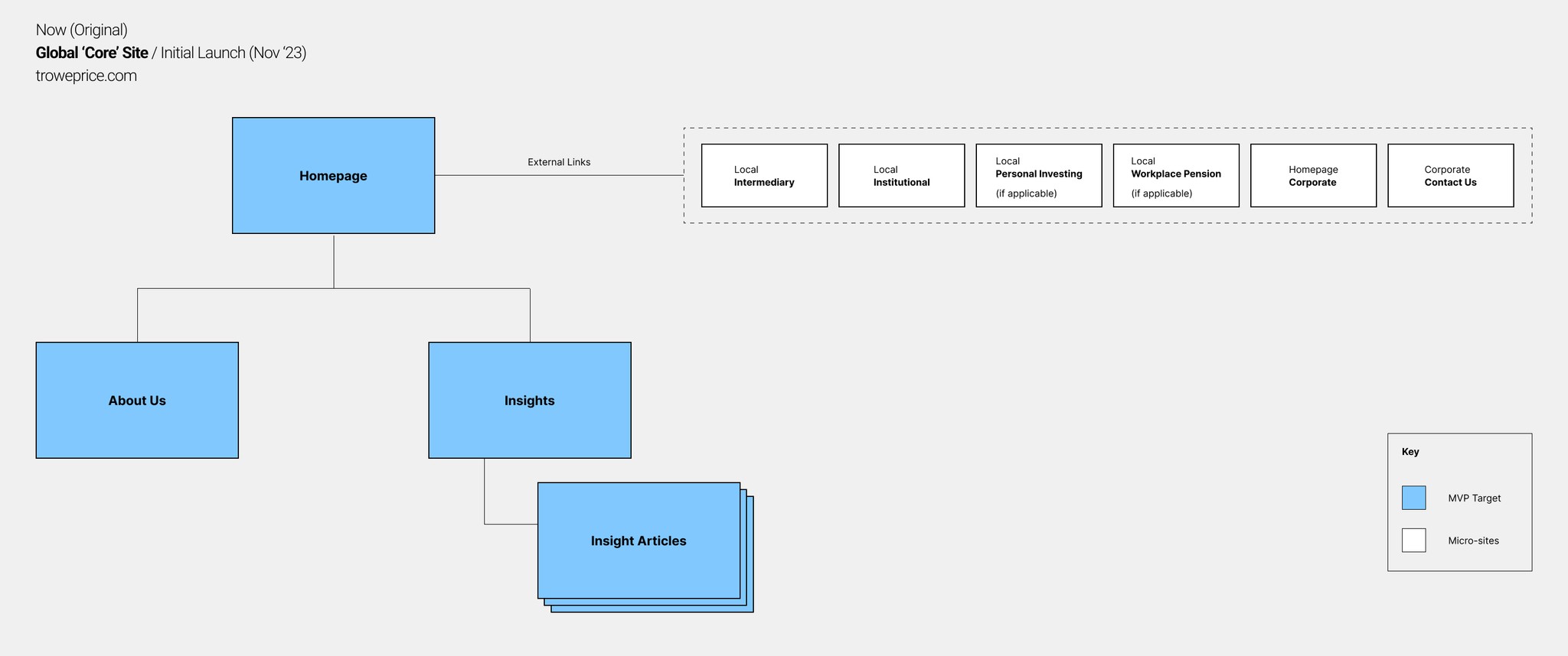
I developed a sitemap outlining the templates constituting the MVP and other upcoming pages post launch. This architecture was shared widely with the team to ensure alignment on the project scope.
A refreshed design system
While a design system existed, it was used only for a few US sites. It needed modernisation for global use. The system design team began rebuilding from the ground up, establishing new foundations and core components. By aligning our roadmaps with theirs, we were able to shape component development to meet our needs.
Once the high-fidelity components were ready, I integrated them seamlessly into the final user interface.
A refreshed design system
While a design system existed, it was used only for a few US sites. It needed modernisation for global use. The system design team began rebuilding from the ground up, establishing new foundations and core components. By aligning our roadmaps with theirs, we were able to shape component development to meet our needs. Once the high-fidelity components were ready, I integrated them seamlessly into the final user interface.
Key Design Decisions
About Us
I started with the About Us page, the most impactful page in the MVP, which aimed to answer the question, “Who is T. Rowe Price?” In collaboration with the brand team, we decided to showcase the principles that underpin T. Rowe Price’s investment strategy and outlook. These principles are universal across all audiences and regions, providing a strong, unified message.
Thinking Hub
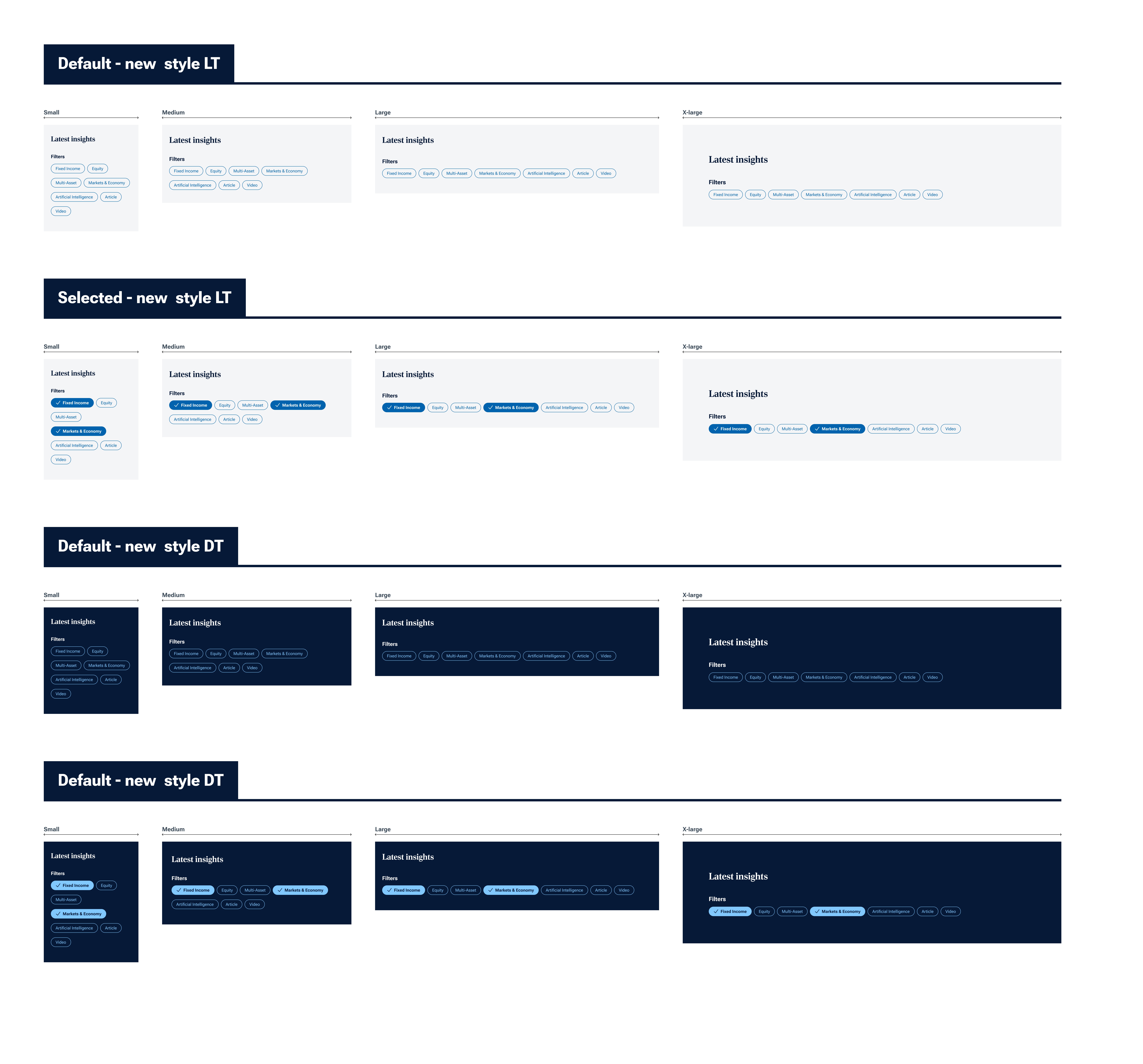
The Thinking Hub hosts thought leadership content. The design needed to support a high volume of articles published under the "Investor 360" brand. To create a visual hierarchy and emphasise high-value articles, we designed flexible article tiles that could be sized up or down and page authors could use light and dark themes to add visual contrast. I anticipated the need for a robust filtering solution but due to scope limitations, implemented a temporary solution using the “chips” component from the Material library with pre-existing code.
Homepage
The homepage served as a navigation hub, directing users to relevant sections or micro-sites. To sustain login and BU conversion rates, we included entry points such as a site selector, login buttons, and page-end tiles. Usability tests with retail users confirmed ease of navigation, achieving a near-perfect completion rate and validating the design for launch.
Outcome & Learnings
Outcome & Learnings
The November 2023 MVP launch wasn't perfect - we were missing some key features like filters - but it proved to be exactly what we needed to kick off T. Rowe Price's Enterprise site journey. Rather than obsessing over perfection, we embraced it as a starting point for continuous improvement. This approach has been brilliant, allowing us to gather genuine user feedback and iterate based on real needs. Our Product team has been carefully analysing the data to ensure each update is grounded in solid research.
What's particularly exciting is how this project transformed our stakeholder collaboration. Post-MVP, we adopted an agile squad model that's revolutionised how our teams work together. I've found this new way of working not only more efficient but genuinely more enjoyable, and I'm keen to see how we'll continue to evolve.
Information Architecture
I developed a sitemap outlining the templates constituting the MVP and other upcoming pages post launch. This architecture was shared widely with the team to ensure alignment on the project scope.
Shaping the MVP
Stakeholders lacked clarity on phasing the Enterprise site’s development. I emphasised that user needs should guide the rollout strategy.
Alongside another designer, I audited existing templates, studied audience profiles and conducted journey mapping to deepen our analysis.
Due to regulatory constraints, product information could not be shown without self identification. Consequently, users would stay on the Enterprise site only up to the consideration phase before moving to a micro-site for detailed product information. This defined the site’s primary focus as acquisition and education.
With these insights, we drafted and refined user stories with the Product Owners, establishing well-defined requirements for the project.
